Carfax Badging, and maybe other 3rd party listing badging

Just had a meeting with Carfax - the badging came up (good, fair, etc). I asked what was the cadence for applying a badge and level. They said it was algorithmic and that they (corporate) does not share. WHAT??? So no customer, or dealer, transparency on why you are badging a vehicle a certain way?

When you click the info button, the website says - for great == "The dealer has priced this car well below the CARFAX History-Based Value."

Note the rep is saying it is more than just price, it is "history based" and takes into account the vehicle history. Like how?

So 2 questions....

1 - do you care that the rating is algorithmic but they don't share, even on basic level, the WHY of the badging. What would push it from good to great?

2 - Do you use these badges, and price/reprice accordingly, when pricing your vehicles for your website and 3rd party listings?

Struggling to Optimize My Ad Spend – Need Help with Campaign Strategy

Without good data, its' hard to make decisions that maximize ROI. Make sure all your data is there. Are you tracking all your leads (including phone calls, chats, sms, etc)? If not, you should. Then make sure they are making it into Google Ads. This will allow you to funnel your $$$ to your best performing campaigns.

PMax campaigns are probably one of the better performing campaign types right now, especially if you add in Vehicle Listing Ads but its' easier to spend a ton there and some mistakes can be costly. Start small, learn, optimize then spend more.
  • Like
Reactions: DjSec

#RefreshFriday Merchandizing - Someone is Launching a new Service | Joe Pistell

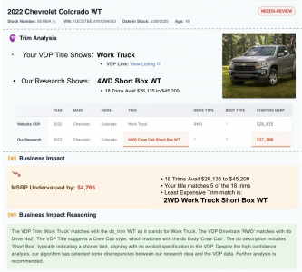
AutoMagic Labs is building a VDP auditing svc.

1752868172184.png
So far,
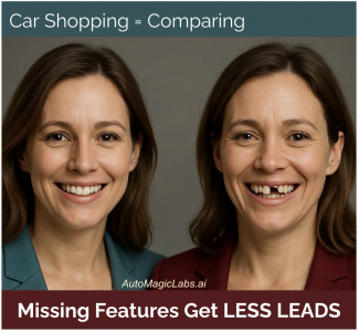
• 37% of all units listed are missing 1 or more key features.
• 99.999% of Dealers don't have the manpower to conduct a full VDP audit for 100's of used cars.


Our goal: Create an automated VDP audit that executes at a fraction of the cost of doing it manually.
1752868950876.png


1752868580899.png
DR Exclusive: HIT LIKE below to get into our beta.

What Should the Perfect Dealership Home Page Look Like?

I've been preaching this here for years...
Someone is going to figure out that putting a human face into the VDP carousel to tell a story about quality is going to sell cars.
1752790999344.png
Our pics are sooo sterile, yet great stores are is soo people dependant.

1752791549582.png
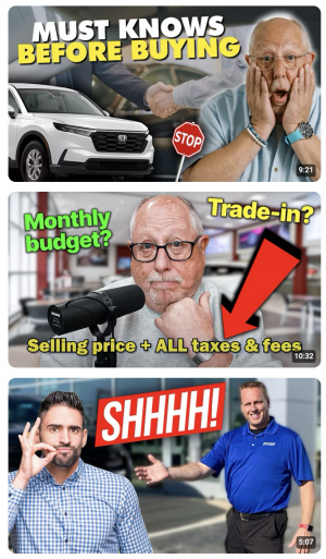
Youtube knows faces gen highest CTR

20 yrs ago, this gal and I sold a lot of cars together (then I married her ;-)
1752790837069.png

What Should the Perfect Dealership Home Page Look Like?

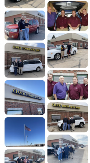
Clocktower is all about people.

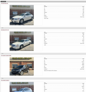
The existing SRP is sterile and lifeless.
>>>The REAL ClockTower is on the right<<<
1752747591998.png1752747714065.png

F*ck the industrial data you're trying to overlay onto ClockTower, it creates a fog that prevents you from connecting shoppers to the ClockTower experience.


YOUR MISSION:
COMMUNICATING WHAT THE CLOCKTOWER CX IS TO THOSE THAT DO NOT KNOW CLOCKTOWER.

What Should the Perfect Dealership Home Page Look Like?

with under 40 cars in stock, I'm wondering how many different ways we should slice the pricing before it becomes cluttered.
Now we're talking.

Want to improve the HP? Study CLOCKTOWER's shoppers.

The SRP is the money maker. You will discover the front page is the 'flyover' page. It has to pass the 5 second smell test ('is this a car dealer? Do they look trustworthy?') The HP's job is to get the shopper into the SRP.... FAST. Your KPI is the CTR of HP to the SRP.

Again, The SRP is the money maker. Study SRP filter use, sort use (I cant believe the orignal site has no sort feature), SRP scroll depth, etc.

STUDY behavior of low engaged 1st time users (the majority of your traffic) vs more engaged 1st time visitors (that do not return).

STUDY behavior of repeat visitors. Create cohorts. What does a failed 1st visit look like? How does it differ from a more engaged 1st vistor? How does the 2nd visitor engage uniquely? Map the 2nd time visitor to their 1st visit. Compare and contrast.
  • Like
Reactions: DjSec

What Should the Perfect Dealership Home Page Look Like?

ClockTower has 30 VINs in stock, about 50% are under $400 a month.
ClockTower has 12 units under Ten Grand.

Think about it.
Financially challenged ppl are getting their ass whopped, they need a store they can trust.

geez you guys.

What Should the Perfect Dealership Home Page Look Like?

Geez. u guys make retail so damn complex.​

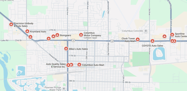
Clocktower is ON THE MAIN DRAG in town.
1752703664575.png

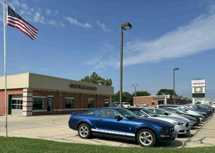
ClockTower has a beautiful store front on the busiest road for miles and miles... SHOW IT OFF.
Get your pro-quality shot of the store on the HP,
----> Business goal "Oh, I know where that store is"
1752703133042.png


I Love the committment to the happy handshakes --->>> SHOW IT OFF
1752703207973.png

1752703376474.png


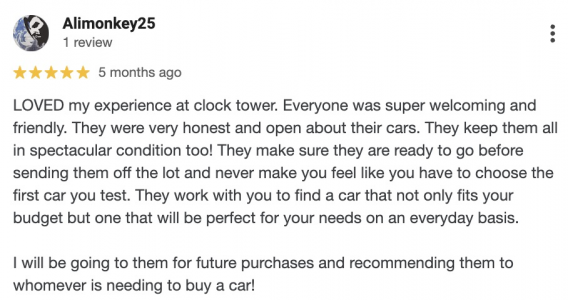
Show off those reviews
1752702849281.png

What Should the Perfect Dealership Home Page Look Like?

Hey man here are a couple quick hits I noticed. But first I gotta applaud you for putting yourself out there and willing to accept criticism/correction I think that's awesome (and not sure I'm brave enough to do it haha!)

On Desktop:
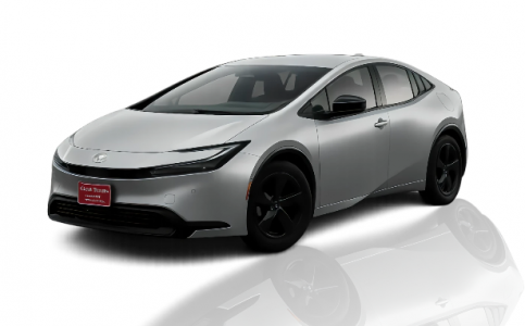
- The main image, the Prius, the reflection isn't necessary. It's incorrect how it's been used and gives it an outdated feel. I'd remove the reflection or correct it to be realistically accurate (where the reflection is coming from under the vehicle) And as a bonus removing the reflection makes the height smaller on mobile.
1752696677274.png
- At the bottom above the footer throw the map with the google business profile embedded on there. I've heard google likes that.
- Remove the WorthWatch section, you have the CTA for trade value right above that.
- No hero image on the Inventory page. If the visitor is on the inventory page, they want to see cars for sale and that's it, no need to make them work harder to get to them..
- If I'm picky, put some links to the other pages in your paragraph text.

On Mobile
- The black info header with hours/phone is just too much valuable space on a phone screen. Along with the menu bar it's easily 1/3rd the screen. Extend the info out so each part is 1 line or drop it to 3 icons for: "Call Directions Hours".
- On my iPhone the hero section buttons are covered so there is nothing to click on.
- make the body styles 2 per row instead of 1 per row.

Hope that helps! I don't know what all you are already working on still or if the site is finished so don't know what else to mention but I'd say the best thing you can do is load it on your phone and navigate the site and see where it needs some Responsiveness updates (vehicle detail pages, Staff page, etc). Shrink things down so the visitor can get to the main thing they are trying to get to with the least amount of friction (ie; scrolling unnecessarily)

Good luck!
  • Like
Reactions: DjSec

How Much Does SEO Cost Per Month in the USA?

Yeah, even though it was a Bot that started this thread (nice SEO work, buddy haha)... I'll chime in because this stuff really excites me.

IMO gone are the days of charging a monthly SEO service fee and creating on page articles and content for longtail keywords. Like what Greg was saying, kiss that traffic goodbye, it didn't provide much anyways.

What I'm shifting too is more along the lines of:
Step 1 remains the same -- Creating a professional, SEO optimized site with all of the key ranking factors taken care of.
Step 2 is not pump the site full of content like -- "How to change a windshield wiper on a Honda Accord in Charlotte" :lmao:

For me, step 2 is now everything outside of the website; creating a pristine Google Business Profile, making sure citations are all there, Optimize for Bing since OpenAI uses Bing, start looking more into Instgram posts now that Google indexes them, engaging on Reddit, youtube content, finding local sponsorship opportunities (with logo/links!!), better trained chatbots, sourcing other local directories, newsletters, creating onpage free widgets/tools with AI....

So still putting in the hours and optimizing the business, just not doing the same ole 'content is king' style of optimizing directly on the site and saying I'll create 2 new blog posts a week.

Instead it's "I'll spend all my time doing all the other things" like Neil Patel calls it 'search everywhere optimization'
  • Like
Reactions: Jeff Kershner

Best Practices On Refunding Down Payment / Deposit In California

Hi,
Do any dealers in California have solutions on deposits / down payments, when to refund or not, and how to protect yourself from flaky customers?

I know that deposits are refundable and I quit taking them after being burned too many times. Agreeing to hold a car for 3-4 days and then having the customer back out is frustrating while getting other interest in the car. A lot of people have moved on to other cars by them time we reach back out saying the car is back on the market.

I landed on taking just a $200 down payment and having the customer sign a law 553 retail contract. They were verbally told that deposits are refundable but down payments are not. We agreed to hold the car 72 hours while they finalized their funds. This has worked well for the most part, but upon further research it appears that down payments are refundable if they don't take delivery of the car (even if law 553 contract is signed).

My logic is $200 is enough to flush out people who are not really serious but its not so much money that they will raise a fuss and pursue legal actions if they did change their mind and lost the money. I told those few people that I would apply the $200 to a future purchase.

Does anybody have any solutions that are fair to both parties in California?

What Should the Perfect Dealership Home Page Look Like?

While we're on the thread, here's a screenshot of what I envision the "perfect" homepage to be. It's part of a modern dealer website platform I'm building. Much of what I've read, learned, and talked about on here is being implemented. Stay tuned for more!

I tried to reduce clutter, make it feel like a sales site, and encourage visitors to browse a greater share of a dealers inventory. When shoppers are in a "which car, which dealer" mindset I'm using the homepage to help show testimonials, value props, as well as promote a "we're the best at sales" type of vibe.
Very unique. I believe it is doing exactly what you were shooting for.

@DjSec and I have been working on this site for a few weeks. I have always tried to look outside our industry for new ideas. I am not afraid to try new and different things because it has really never mattered what I was doing for a website...the overall snapshot really never changed.

I started with a Dealer Car Search website when I opened 14 years ago. Within a few months our overall traffic topped out.

A few years later I switched to a company called Auto Corner. I worked directly with the owner of the company because of the new ideas that we had. He was an incredibly nice man that genuinely cared about his clients. Within a couple of months, the overall website traffic got to about what it was with the previous designer and never really changed.

A few years later, Carbase reached out to me because of comments that I made here in Dealer Refresh. Away we went, they built the exact website that I wanted (my current site was really fresh and new when it was built) with the help of a Franchise Dealer Group on the east coast. The ideas were mine but I didn't want to spend the money it would take to have that website. The group saw the ideas and were willing to pay to have it built and allowed me to use the same platform. Once again, traffic really never changed.

I would throw in some Facebook Marketing and soon it was my number one source for website traffic...but the overall numbers didn't really change.

I would throw in some Google Ads and soon that would be my number one source for website traffic, same thing. No real change.

I spent hours and hours creating content for that Carbase Website. Every one of those Why Buy and warm fuzzy pages was written by me and I did not take it lightly. Guess what, nobody reads it. Heat Mapping is the most humbling thing that there is when it comes to this. Guess what matters to the customer...PICTURES. Those are the hot spots, no matter what I change. My Data Pool isn't big enough to move the needle.

Long story short, it doesn't bother me to try something new and different. I am shooting for a level of simplicity that I have never seen before. I believe we are getting there. @Chris Cachor , thank you very much for helping this along. You are offering some really good ideas. Nobody is getting their feelings hurt either. I really appreciate it as does @DjSec .

What Should the Perfect Dealership Home Page Look Like?

While we're on the thread, here's a screenshot of what I envision the "perfect" homepage to be. It's part of a modern dealer website platform I'm building. Much of what I've read, learned, and talked about on here is being implemented. Stay tuned for more!

I tried to reduce clutter, make it feel like a sales site, and encourage visitors to browse a greater share of a dealers inventory. When shoppers are in a "which car, which dealer" mindset I'm using the homepage to help show testimonials, value props, as well as promote a "we're the best at sales" type of vibe.

Attachments

  • Untitled-1.jpg
    Untitled-1.jpg
    151.1 KB · Views: 20

What Should the Perfect Dealership Home Page Look Like?

Absolutely agree and I think tools like v0.dev are game-changers. I really appreciate the link and even used it as inspiration to do a full redesign of the homepage layout. Would love for you to take a look when you get a moment.

That said, I still think human-led structure, logic, and experience design matter especially when it comes to semantic HTML, accessibility, SEO, and understanding the buyer journey.

The output from v0 was fast, but also written in .tsx, which isn't valid HTML and won’t index properly without translation or pre-rendering. So I see AI as an accelerator, not a replacement (yet!).

Absolutely feel free to PM me with the link. I'm happy to help! As far as the v0.dev output -- you can ask it to prompt straight to HTML as well as marking up for accessibility, etc. You can't preview it usually, but it will export the file for you to copy. It's well worth $20/mo. It's one of the better front-end tools. Figma AI is another.
  • Like
Reactions: DjSec

#RefreshFriday Merchandizing - Someone is Launching a new Service | Joe Pistell

We, as an industry, under value how hard it is to shop for cars...
1752108034631.pngExample: 2026 Cadillac Escalade.
• The 2025 base trim was named “Luxury”, now has been renamed simply as “Escalade,”
• The 2026 “Premium Luxury” trim has been renamed “Luxury" <---oh shit! that was a Base in 2025!
• The “Sport” trim is remains unchanged” for 2026,
• The “Premium Luxury Platinum” becomes “Platinum Luxury”
• The “Premium Sport Platinum” becomes “Platinum Sport,”.
• Finally, the high-performance “Escalade-V” remains unchanged”

Thats one model in one OEM for one year.
We, as an industry, under value how hard it is to shop for cars and how hard it is for a sales rep to be a product expert (that the customer needs)
  • Like
Reactions: Karen Ann

What Should the Perfect Dealership Home Page Look Like?

We removed their giant promo sliders and replaced them with 3 simple call to action options:

yo Craig, love what u r doing.
Consider adding a 'Finance" link to the header menu.
1752107152909.png
If you listen to a few thousand calls, Reps are always talking the shopper into using the finance link to get ppl to commit over the phone. Reps want to guide the shopper right to the link, so, make it easy to find.

p.s. @DjSec listen to calls, read emails and chats. You'll get a far better read on what sells cars.
  • Like
Reactions: craigh

What Should the Perfect Dealership Home Page Look Like?

Even small things like not using Times New Roman, creating a style guide for consistent fonts, margins, and padding, and using more modern icons can make a big difference.

I was going to say the same thing about the overlay on the photos, but then I realized that font is bolted to the side of the building :)

1752085341834.png

What Should the Perfect Dealership Home Page Look Like?

I will throw in my 2 cents here:
  1. Agreed on page speed being important, but not all important - alot of the studies on this read to me as BS studies done to push people towards specific technologies or vendors. The actual end user on their phone (70% of your traffic?) is unlikely to get a sub 1-second load time given all the external conditions. Once on the site, things like caching and lazyloading make a much bigger difference than the initial page load of the homepage.

  2. Agreed on trying to focus websites - I have a couple dealers that have similarly agreed to do the simple approach. We removed their giant promo sliders and replaced them with 3 simple call to action options:
1752084834531.png

We only went live just recently, but we will be watching the data closely to see if there is any changes in traffic patterns. One thing we've already seen is less people wandering around different service pages looking for the Book Service form. One of the other things I am interested to track is sending consumers to All inventory (rather than new or used) and letting them filter down as they see fit - I am very curious to see if every customer immediately chooses between New or Used if they don't have to.

1752085053731.png


It's been a while since I've had some fun with websites, but we're trying new things with a few dealers who turned down their classifieds spend and are replacing it with digital spend direct to the website.

What Should the Perfect Dealership Home Page Look Like?

Sorry I don't have a lot of time to go through each bullet point -- but page speed shouldn't be a talking point. It's a core expectation. With the navigation, the simplification is good but if that's core functionality -- why isn't that more prominent?

Anyways, I fed some of this info to a service (v0.dev) -> https://v0.dev/chat/clock-tower-website-redesign-bWhYAg16AoB

Do you see what I mean? An AI model can kick out quality work in seconds. As professionals, the baseline expectations are much higher now. Which means we can deliver at high quality, quicker, and hitting core objectives. Feel free to refine the prompt for what your customer is looking for. But I'm just trying to point out doing some of the design by hand isn't necessary anymore. I also think you may be too deep in the weeds on some of these stats and what not...zooming out and starting with the customer and working backwards, and using all the available tools to make it happen is what I think success looks like.

Filter