- May 1, 2005
- 4,509
- 1,794
- Awards
- 12
- First Name
- Jeff


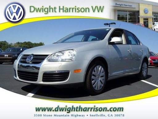
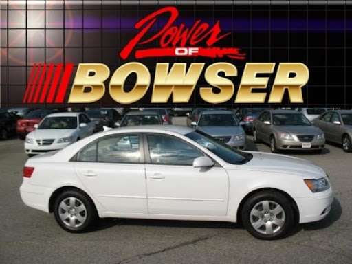
I've been back and forth with overlays over the last several years. Been waiting on HomeNet to offer different overlays according to ad source and vehicle options/CarFax. I used to do them individually back when.
I've come to a solid conclusion - your overlays are like a display ad. They can help brand and can also help drive a message.
Before building out your overlays, be sure your camera crew are on board and you are positioning your photos to compliment your overlay.

Joe and
Wow - some of these overlays are HUGE! I stopped using them years ago. But I will say that some of these are pretty with the right car selected. Does pretty make someone pick up the phone more?
IMO, the unique photo overlay comes into play on Classified sites when a shopper is back for a RETURN VISIT. When they make it back to the SRP (Search Return Page), they scan the thumbnails looking for that "lil guy" that had that good Ford Taurus the shopper saw 2 days ago.
IMO, visual impact takes precedence over style (unless your a mega high-end store). Adding a "lil guy doing something silly" overlay is memorable and is a damn smart branding tool.
Note to self... Add this to my todo list. Must create and add silly lil guy to overlay


Uncle Joe, I'm amazed. I just checked the mega-store to the north of you expecting to see an overlay of a 'lil guy" screaming about being huge. Not there! Just plain Jane car images. Talk about missed opportunities!
==> I even have a Billy F. bobble head on my desk. It gives the cat something to knock over.


We are hoping to make a photo booth soon, but what do you think of our over lay?
The little star burst has about 5 different variants based on the vehicle...