• Stop being a LURKER - join our dealer community and get involved. Sign up and start a conversation.

What Should the Perfect Dealership Home Page Look Like?

DjSec

Boss
Mar 17, 2025
141
41
Awards
2
First Name
Gregg
Hey everyone, I’m working on the homepage for Clint over at Clocktower Auto (Clock Tower Auto Mall) and I’d love your thoughts on what I’ve done so far and where I can tighten things up.

I'm going to explain my thought process but I'm not saying this is correct, more putting it out there in detail so you can more easily find the flaws in my thinking.

We got load times below a second on Google's Light House tool on mobile. I've not seen a website that gets 100% across the board on Google's lighthouse tool so this might be the fastest website in the world. :cool:


Page speed seems to be the #1 factor when it comes to getting a sites content spidered, ranked, and converting according to:

1.) Koons Automotive says they say a 1,400% increase in conversions when they speed up their site.

2.) Dealer Inspire says sites that load in under 2 seconds convert 40% more leads.

3.) CDK said every second improvement in load time converts 20% more leads on the vehicle description page.

4.) CarParts.com optimized their site for speed and got 13% more leads.

5.) Dealer Magazine said sites that load in under 3.8 seconds get 30 more leads per month.

6.) Auto Jini said a 1 second delay gets 7% fewer leads.

7.) And of course you’ve got Google, Walmart, Amazon and all the other talking about page speed.

So we made the site ADA compliant, error free, and super fast!

Now it's time to talk about the design...


1. Top Nav


There have been several studies done that have shown the more options you give someone the less likely they are to make a decision, and for this reason as well as the ability to better control the internal link juice flow, I've limited the top navbar to just three links.

Studies have shown you can see a 30% increase in conversion by limiting the top nav to five links or less!

Above the nav we have:
  • Phone number
  • Location/address
  • Hours
  • Menu:
    Logo (clickable to homepage)
    • Shop Cars
    • Sell/Trade
    • Financing
By reducing menu choices to just 3, I believe we are increasing the likelihood of clicks and conversions. Especially on mobile devices, where clutter kills usability and giving us more control over internal links.

Focus on Conversion

Each of the three menu items serves a purpose in the buyer journey:
  • Search Cars → intent to buy
  • Sell/Trade → drives inventory leads
  • Financing → captures early buyer interest
I’m trying to direct users to where money is made buying, selling, and financing.

Clear Supporting Info

Keeping the phone, address, and hours separate from the menu and making them non-clickable (or supportive) trust-building elements, not decision-fatiguing links.

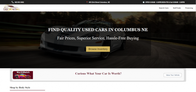
And again you can see the home page here.


2. Hero Section (Above the Fold)

The idea behind the hero image was to focus on the main keyword of the page, clarify the offer, enhance the flow, nod at the Call To Action (CTA), show the benefits, answers some questions, and paint a picture that puts the customer in the center of the action, playing the part of the hero.

While giving as little information as possible to prevent information overload.

We didn’t use sliders or videos because studies have shown both kill conversions! Once we get the users attention, it’s the call to actions job is to guide them through the site, the idea being that we want to control their attention and direction the entire time they are on the site.

We originally had a site search but decided a link to the list page might be better, requiring less work from the end user!


3. Vehicle Value Link

The thought being if the call to action didn’t work maybe they are looking for something else so I stuck the vehicle value link here.

But what should it say?

  • “Just curious what your car is worth?”
  • “Thinking about trading in?”
  • “We’ll buy your car, even if you don’t buy from us.”

4. Filter by Type

If they’ve ignored the hero search, and didn't click the trade-in link, but they’re still scrolling, they’re browsing. Now’s the time to make it easy and visual for them to re-engage with Body Style buttons (Car, Truck, SUV, Van).
  • Visual: Easy to recognize and click
  • Low effort: No thinking, just “Oh, I want a truck” → click
  • Broad appeal: Helps users who aren’t sure on make/model
  • Funnels traffic: Segmenting buyers early
  • SEO: Breaks pages up allowing me to rank more pages


5. Car Value/Financing

If they haven’t clicked yet, they’re interested but undecided so I figure I’ll give them a low-pressure, high-value CTAs that speak to both buyer and seller. I’ll hit them up with two call to actions by splitting the page, rewording get your cars value link and offering them a credit approval link as well.


6. Trust building

If the visitor hasn’t clicked any CTA yet, there’s a good chance they’re stuck in “Can I trust these guys?” mode. I figure it might be a trust issue so I added some text about the dealership and talked about the number of reviews, cars sold, and so on.


7. Featured Inventory

If a visitor has made it all the way to the bottom without converting on:
  • Hero search
  • Trade-in CTA
  • Financing CTA
  • Body style buttons
  • Trust section
…then they’re either just browsing or not sure what they want.

So I figure I’ll show them some featured inventory as a last-chance nudge that says: “Here are a few great deals you might like, take a look before you go.”

That’s where I’m at. I’m curious:
  • What tweaks would you make to the flow?
  • Any experiments you’ve tried on your own homepage that surprised you?
  • Did I miss any must‑have elements for a modern dealership site?
Appreciate any feedback you’ve got...thanks in advance!
 
  • Like
Reactions: craigh
I think your post reads well but I think the execution misses the mark. I wouldn't get overly obsessed with page load times. Just try to be reasonable. If you think it takes too long to load, most other people will too.

There's no visual appeal to the homepage. It looks bland and lacks energy. There's no real order to the vehicles -- why not put them by category? Why scroll up and down and not left to right (on mobile)? I would take a look at some of the higher quality UX sites (Carvana, CarMax, etc) for inspiration. I realize this is a smaller store so certain things don't apply -- but I think the UX quality absolutely does.

I think once you get the visual and UX to a certain level, then tailor things to Clock Tower's target market and communicate how you could meet their needs.
 
  • Like
Reactions: joe.pistell
I wouldn't get overly obsessed with page load times. Just try to be reasonable. If you think it takes too long to load, most other people will too.
Hi Chris,
Thanks for the feedback, I really appreciate it.

Let me respond to a few of the points you raised so I can better understand and improve.

I definitely hear you on not over-obsessing about load times. The reason I emphasized it is because there’s a surprising amount of data linking faster sites to better conversion rates:
  • Koons Automotive reported a 1,400% lift in conversions after speeding up.
  • CDK says each second shaved off the VDP adds 20% more leads.
  • Google has also said they’re less likely to crawl or rank slow-loading pages, especially on mobile.
So for me, speed is less about bragging rights and more about access especially for rural or mobile users on slower networks. That said, I don’t think speed should come at the cost of design. So I’m working to strike a balance there.
However Let’s say:
  • A dealership currently gets 500 visitors a month.
  • It converts leads at a 2% conversion rate (that’s 10 leads).
  • The closing rate on those leads is 30% (industry average).
  • That means the site is generating about 3 car sales per month right now.
Lets say you improve page speed by 1 second:

According to the data:
  • CDK says each second improvement increases leads by 20%.
  • AutoJini says a 1 second delay reduces leads by 7%, so fixing it is a 7% gain.
  • Dealer Inspire says sub-2s sites convert 40% more leads.
  • Koons saw 1,400% more conversions after speeding up (a big outlier).
Let’s be conservative and go with just a 20% increase in leads from speeding up the site by one second.

Resulting impact:
  • 10 leads/month → 12 leads/month
  • 12 leads × 30% closing rate = 3.6 car sales/month
  • That’s +0.6 cars/month, or 7 more cars/year just from improving speed by 1 second.
What’s that worth?
  • Average gross profit per used vehicle: ~$2,000
  • 7 extra cars × $2,000 = $14,000/year in extra profit
And that’s from just one second of load time improvement.

What if the site used to load in 19.2 seconds, and now loads in under 1 second?​

If you apply the 40% lead increase that was reported:
  • Starting point: 10 leads/month
  • After 40% boost: 10 × 1.4 = 14 leads/month
  • Close rate: 30%
  • 14 × 0.3 = 4.2 car sales/month
  • That’s 1.2 extra sales per month
  • Over a year: 1.2 × 12 = 14.4 more cars sold
  • Average gross profit per used car: $2,000

14.4 cars × $2,000 = $28,800/year in additional profit
And that's not counting improvements in ranking and because of those improvements the site getting more traffic.

There's no visual appeal to the homepage. It looks bland and lacks energy.
This part really caught my attention, and I'd love to hear more. You mentioned the site looks bland and lacks energy do you mean the color palette, typography, photography, or layout? Or maybe the hierarchy isn’t clear enough?

Also, just to clarify: are you looking at the old Clock Tower Auto site or the new one I’m building? I want to make sure we're both evaluating the same version.
There's no real order to the vehicles -- why not put them by category?
Could you expand on what you mean by that? Are you suggesting something beyond the "Shop by Body Style" section (e.g. SUV, Truck, Sedan)?

We grouped vehicles visually by body type as a way to help indecisive users browse more easily, but I’m open to exploring other types of categorization price tiers, fuel type, top picks, etc.

If you’ve seen examples that work well, feel free to link them...I’m here to learn.

Why scroll up and down and not left to right (on mobile)?
Interesting note! I actually considered horizontal scrolling briefly but ultimately went with vertical for a few reasons:
  • Vertical is what most users expect today (thanks to TikTok, Facebook, etc.).
  • NNGroup research shows horizontal scroll often confuses users unless very clearly indicated.
  • It's also easier to implement responsive layouts when working vertically, especially with touch devices.
That said, I could see horizontal working well for smaller sections like featured cars if styled correctly.

I would take a look at some of the higher quality UX sites (Carvana, CarMax, etc) for inspiration.
On Carvana, CarMax, and Design Inspiration

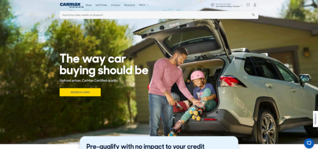
You're totally right that Carvana and CarMax set a high bar for UX and we actually studied both of them (along with about 1,000 other sites) when planning this layout.

If you look at CarMax’s homepage above the fold, they’ve got:
  • A clean nav
  • A search bar
  • A large hero image
We followed a similar approach:
  • We kept the navigation simple and uncluttered
  • Instead of a search bar (since we have far fewer vehicles), we opted for a prominent CTA button that leads directly to inventory
  • We also made two changes based on UX and accessibility research:
    1. Reduced the hero height: Sseveral CRO studies suggest shorter hero images increase engagement and reduce bounce
    2. Added a screen overlay to the image for ADA compliance. CarMax’s own site actually doesn’t meet WCAG standards.
That said, I'm always open to revisiting this. Based on the screenshots below is there a specific element you'd adjust? Would love to hear how you'd visually enhance the hero section while keeping performance and accessibility top of mind.1.2.png

1.1.png

I think the UX quality absolutely does.

I think once you get the visual and UX to a certain level, then tailor things to Clock Tower's target market and communicate how you could meet their needs.
Totally agree: UX quality absolutely matters, no matter the size of the store.

And that’s actually what I’m trying to improve here clean design, focused flow, fast loading, and clear CTAs that speak directly to buyers and sellers.

If you don’t mind sharing, I’d love to hear more specifics on what stood out to you as “off” or in need of refinement. Was it:
  • Spacing or visual hierarchy?
  • Button placement or labels?
  • Inventory layout?
  • Font sizes or color usage?
  • How things feel on mobile?
More clarity would help me a ton I'm genuinely looking to make this better and I appreciate your feedback.

I think once you get the visual and UX to a certain level, then tailor things to Clock Tower's target market and communicate how you could meet their needs.
I actually really appreciate this point, because it made me pause and think.

I felt like we had done a good job of aligning the site with Clock Tower’s market things like:
  • Fast load times for rural and mobile users
  • Simple navigation focused on Buy / Sell / Finance (the three core dealership money-makers)
  • Trust-building sections (reviews, vehicles sold, local credibility)
  • A layout that prioritizes low-effort CTAs and a funnel-style flow for undecided visitors
That said, maybe I’m missing something in how that’s being communicated, or maybe it’s not connecting clearly enough with the actual needs or mindset of Clock Tower’s buyers.

Could you help me go a little deeper here?
  • Do you think we’re missing something about their local buyer behavior?
  • Is it more about tone or language (e.g. being more community-focused or conversational)?
  • Or are there specific visual or structural elements you think would better resonate with their target audience?
I’d love to dig into because I want the site to not just be fast and functional, but feel right for the people it’s meant to serve.
 

I agree with @Chris Cachor - the UI/UX could definitely use some polishing. Right now it honestly looks like a tech guy designed it.

Even small things like not using Times New Roman, creating a style guide for consistent fonts, margins, and padding, and using more modern icons can make a big difference. And if that's not your strong suit, there are plenty of freelancers who can throw together a quick Figma prototype for you to work off of. Speed is definitely important for conversion, but so is UI/UX.

Also I’m sure you might already be working on this, but inventory search filters are super important for most dealerships. You might be able to get away without them if you only have 10-20 cars in stock, but once you’re past that, they’re pretty much a necessity.

Love to see that you’re putting all of that theory into action though!
 
Sorry I don't have a lot of time to go through each bullet point -- but page speed shouldn't be a talking point. It's a core expectation. With the navigation, the simplification is good but if that's core functionality -- why isn't that more prominent?

Anyways, I fed some of this info to a service (v0.dev) -> https://v0.dev/chat/clock-tower-website-redesign-bWhYAg16AoB

Do you see what I mean? An AI model can kick out quality work in seconds. As professionals, the baseline expectations are much higher now. Which means we can deliver at high quality, quicker, and hitting core objectives. Feel free to refine the prompt for what your customer is looking for. But I'm just trying to point out doing some of the design by hand isn't necessary anymore. I also think you may be too deep in the weeds on some of these stats and what not...zooming out and starting with the customer and working backwards, and using all the available tools to make it happen is what I think success looks like.
 
Last edited:
I will throw in my 2 cents here:
  1. Agreed on page speed being important, but not all important - alot of the studies on this read to me as BS studies done to push people towards specific technologies or vendors. The actual end user on their phone (70% of your traffic?) is unlikely to get a sub 1-second load time given all the external conditions. Once on the site, things like caching and lazyloading make a much bigger difference than the initial page load of the homepage.

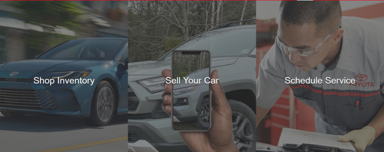
  2. Agreed on trying to focus websites - I have a couple dealers that have similarly agreed to do the simple approach. We removed their giant promo sliders and replaced them with 3 simple call to action options:
1752084834531.png

We only went live just recently, but we will be watching the data closely to see if there is any changes in traffic patterns. One thing we've already seen is less people wandering around different service pages looking for the Book Service form. One of the other things I am interested to track is sending consumers to All inventory (rather than new or used) and letting them filter down as they see fit - I am very curious to see if every customer immediately chooses between New or Used if they don't have to.

1752085053731.png


It's been a while since I've had some fun with websites, but we're trying new things with a few dealers who turned down their classifieds spend and are replacing it with digital spend direct to the website.
 
  • Like
Reactions: DrewAment and DjSec


Write your reply...