• Stop being a LURKER - join our dealer community and get involved. Sign up and start a conversation.

Are you VOMITING on your VDP?

Reposting my comment on the original article...

In my opinion, the ultimate VDP would be fully context aware. By that I mean its content, layout and primary CTAs are dynamically determined based on multiple factors: new/used, vehicle type, mobile/desktop device, vehicle price point, number of previous website visits, visitor's distance from dealership. I could go on.


The more you know about your product, its position in the market and your website visitor, the more you will be able to tailor your digital sales pitch (i.e. your VDP content and presentation) to generate more leads. Personally tailored content and presentation will always convert better than generic & templated, irrespective of whether that's via form capture or walk-ins. Getting a website provider to give you this flexible capability would be a challenge, but we are talking about ultimate here.


On the specific point of CTAs, the key point for me here is that they are few in number and that they don't negatively impact the visitor's shopping experience. As an example, I personally don't like embedding a full inquiry form into the VDP page itself. I prefer a button which triggers a popup form so this important VDP screen space isn't taking up mindshare of the visitor who is still in the middle of their decision making research. However, I know some people have A/B test data saying the opposite which is fair enough. This is perhaps one of the areas where the most trackable/tangible lead generating CTA (form capture) negatively impacts the less tangible/trackable conversions (user research satisfaction and number of walk-in leads). In these cases, rightly or wrongly, trackable almost always wins out.
 
Uncle Joe Rule #61:
"Auto Shoppers make 2 decisions, WHICH car and WHAT dealer".
If 98% of your VDP real estate is all about the car, then you need to give your web vendor the smack-down and fight for VDP real estate to tell YOUR story.


Totally agree with this.
Going back to my point regarding contextually changing your VDP content/layout. Getting the right balance between how much car, how much dealership and how much other "supporting" information you display could come down to: new vs used, first-time vs returning visitor, search criteria used (e.g. upper limit on price). Lots of possibilities to help you best display what's relevant to the shopper and show them why your dealership is best placed to serve their specific needs.
 
Chris,

What software do you use to screenshot the whole page?

Yes, I use Awesome Screenshot for Safari (Mac).

In my opinion, the ultimate VDP would be fully context aware. By that I mean its content, layout and primary CTAs are dynamically determined based on multiple factors: new/used, vehicle type, mobile/desktop device, vehicle price point, number of previous website visits, visitor's distance from dealership. I could go on.

Great ideas and I agree. Many of the CTA's take the one sized fits all approach, even among different OEMs. Theres quite a bit of value that can be gained if you think of the investment required. Most website providers operate on a shared codebase, so the Lexus dealer has the same CTA's as the Chevy dealer. Taking the time to develop detail/landing pages for the brand or demographic I think is low hanging fruit for the website providers to differentiate themselves from their competitors.
 
  • Like
Reactions: 1 person
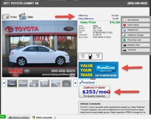
I have always thought that the VDP should try it's best to answer all of the questions that a prospect has. They landed there because they have interest in the car, now it's time to help them make a decision. Most all car buyers want to know 3 things: 1 - Is it priced fair? 2 - What's my trade worth? Using tools like ATC TIM, Blackbook Online, PureCars Trade tool 3 - What are my payments going to be? Payment calculators, Drive-It-Now, Dealertrack tool etc. If we can provide the answers to those questions, we have a better chance of converting them. Thoughts?

Camry-VDP.jpg
 
  • Like
Reactions: 1 person
Most all car buyers want to know 3 things: 1 - Is it priced fair? 2 - What's my trade worth? Using tools like ATC TIM, Blackbook Online, PureCars Trade tool 3 - What are my payments going to be? Payment calculators, Drive-It-Now, Dealertrack tool etc. If we can provide the answers to those questions, we have a better chance of converting them. Thoughts?

I think those are the big ones that ultimately influence them showing up at your store. I think the website is a pretty good primer for what to expect at the actual store (usually well put together dealer sites have very strong internet departments). So it's important to invest time and attention to detail there.

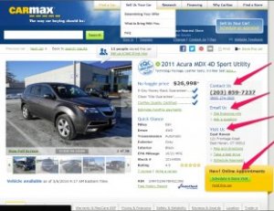
Going back to the Carmax design, I think what they really do best is cover the bases as the user scrolls down the page. They first cover price and return guarantee, list some basic details of the car, as well as the contact info right next to it. I assume this is deliberate so that anyone interested will call/email right away vs. delving into the details further down below. They also separated this out in a different color to draw your eyes as they move from the photo.

What's surprising is that out of most VDPs, Carmax chose lead actions with good placement/copy over large grouped together buttons. The way their page flows I think just goes to show that people still read web pages.

They definitely do a great job reinforcing that buying a vehicle from them is safe and there are no surprises to pricing. I think even their calculators include local/state tax rates so you could get a pretty accurate estimate of monthly payments.

Jeff, yea they must do quite a bit of A/B testing on this site. The initial changes I wasn't happy with (I thought their head guy left) but they're slowly growing on me. Some of the lead actions are pretty good too. They're getting better at adding some more social features to the site to further increase trust. I've seen Expedia do this in a very elegant way too.
 
...Going back to the Carmax design, I think what they really do best is cover the bases as the user scrolls down the page. They first cover price and return guarantee, list some basic details of the car, as well as the contact info right next to it. I assume this is deliberate so that anyone interested will call/email right away vs. delving into the details further down below. They also separated this out in a different color to draw your eyes as they move from the photo.

What's surprising is that out of most VDPs, Carmax chose lead actions with good placement/copy over large grouped together buttons. The way their page flows I think just goes to show that people still read web pages.
I think CarMax does a really GREAT job recognizing that the car business ISN'T ecommerce. The vast majority of almost every dealers customers walk in - AFTER conducting extensive research online first. CarMax invests more screen space getting the customer into the store compared to getting the customer to pick up the phone or send an email. That is because CarMax is smart.

Way too many AutoMarketers spend all their time thinking like ecommerce guys - we're not there (yet).

CarMax_VDP.jpg
 
  • Like
Reactions: 3 people
I think CarMax does a really GREAT job recognizing that the car business ISN'T ecommerce. The vast majority of almost every dealers customers walk in - AFTER conducting extensive research online first. CarMax invests more screen space getting the customer into the store compared to getting the customer to pick up the phone or send an email. That is because CarMax is smart.

Way too many AutoMarketers spend all their time thinking like ecommerce guys - we're not there (yet).

Double like! Very good point.