• Stop being a LURKER - join our dealer community and get involved. Sign up and start a conversation.

Accidental Lesson on CTA Placement

Dec 19, 2018
550
492
Awards
6
First Name
Bill
We were recently working with TradePending on adding a CTA for their trade tool on our form submission complete page when they accidentally placed the CTA along with the regular CTA stack that we have on the VDP page (attached). We've always had the tool on the VDP (attachment 2), but just in a different place and in a different style. We have not received a high number of leads from the original placement, but before they could remove the button they accidentally placed, all of a sudden we started receiving leads from the tool daily.

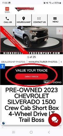
Screenshot_20240113_115650_Chrome.jpgScreenshot_20240113_115644_Chrome.jpg
 
  • Like
Reactions: Alex Snyder
@BillKVMotorCo
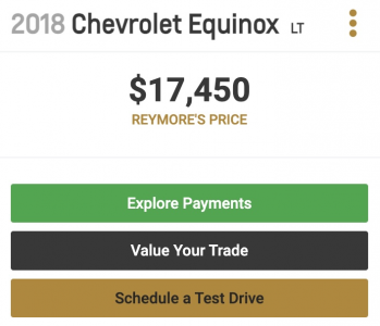
I am with you. Here's my pilot dealers CTA layout.
1705246855098.png
CTA logic:
1) If they land on a car (great pics & price),
2) they want to explore payments.
If they like pics, price and payments,
3)they want a tradein value.
If they like pics, price and payments and tradein range,
4) they want to schedule a test drive*

*CTA call us is great too.
 
  • Like
Reactions: Alex Snyder
This might not be what you did, Bill, but I've seen something similar many times. And I'm guilty of what I'm about to say, too... so many times :egads:

We all get excited about the new shiny thing and give it special placement on our site, but it doesn't get the results we wanted. Technologists come up with a new way to do something, and it doesn't get the engagement they wanted. After seeing and doing this as a dealer and in different tech companies, a simple lesson has been learned:

Don't fuck with customer expectations.

If CTAs are in the same places on consumer sites, mimic that. If a customer searches for a car via drop-downs on most consumer sites, mimic that. It is easy to forget car shoppers are car shoppers once every few years. They are grocery shoppers, electronics buyers, Amazon browsers multiple times a month/week. When you introduce something different, you confuse and frustrate people. I know, this is an excitement killer, but when you're doing something different, it never hurts to have "Plain Jane Boring Plan B."

P.S. This post is mostly for future Alex and developers he is talking to.
I think this is great feedback. I'd say this was the result of a combination of laziness on my part in assuming the vendor knew what they were doing with the placement. Pretty wild how much of a difference it has made moving it to where it should have been in the first place. But I'm glad that it happened because I would say I have not done a good job of thinking where customers' eyeballs go. I also need to do a better job of seeing where things land on mobile. I make the mistake of evaluating some things based on desktop because that's the space I work from. Stupid, I know.
 
The accidental CTA placement on the VDP page, as shared by @BillKVMotorCo, demonstrates how small changes can significantly impact user engagement. This incident reminds us of the importance of experimenting with CTA placements and adapting to unexpected results.

The discussions by @Carsten, @joe.pistell, and @Alex Snyder about aligning CTAs with user expectations and behaviors are insightful. Balancing innovation with familiarity is key to a positive user experience.

Additionally, the emphasis on mobile-first design, highlighted by the increase in mobile usage, is crucial. Optimizing websites and CTAs for mobile is essential in today's digital landscape.

Thanks for the valuable insights. They underscore the importance of being adaptable and user-centric in our approach.
 

Attachments

  • 1705407389735.gif
    1705407389735.gif
    42 bytes · Views: 3
  • 1705407389763.gif
    1705407389763.gif
    42 bytes · Views: 3
  • 1705407389781.gif
    1705407389781.gif
    42 bytes · Views: 2
The accidental CTA placement on the VDP page, as shared by @BillKVMotorCo, demonstrates how small changes can significantly impact user engagement. This incident reminds us of the importance of experimenting with CTA placements and adapting to unexpected results.

The discussions by @Carsten, @joe.pistell, and @Alex Snyder about aligning CTAs with user expectations and behaviors are insightful. Balancing innovation with familiarity is key to a positive user experience.

Additionally, the emphasis on mobile-first design, highlighted by the increase in mobile usage, is crucial. Optimizing websites and CTAs for mobile is essential in today's digital landscape.

Thanks for the valuable insights. They underscore the importance of being adaptable and user-centric in our approach.
We're currently playing with moving the entire CTA stack up. I don't know how I feel about it since it moves it above some of the vehicle details (the one that worries me most is miles on used vehicles), but I think it's valuable to at least experiment.
 
I think this is great feedback. I'd say this was the result of a combination of laziness on my part in assuming the vendor knew what they were doing with the placement. Pretty wild how much of a difference it has made moving it to where it should have been in the first place. But I'm glad that it happened because I would say I have not done a good job of thinking where customers' eyeballs go. I also need to do a better job of seeing where things land on mobile. I make the mistake of evaluating some things based on desktop because that's the space I work from. Stupid, I know.
Thanks for sharing this, and a great reminder for my marketing brain to have "strong opinions, loosely held". I can believe all sorts of things, but results trump opinions.