• Stop being a LURKER - join our dealer community and get involved. Sign up and start a conversation.

Cars.com BIG DROP since new design?

LotPop

3rd Base Coach
Sep 25, 2013
41
14
First Name
Jasen
There seems to be something going on with Cars.com stats since the change to their new site layout. I help about 2 dozen dealerships in all different markets and they all carry different franchises and I am seeing the same trends at these stores.

I want to open up this conversation to see if anyone else is seeing the same trends?


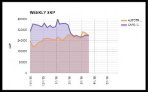
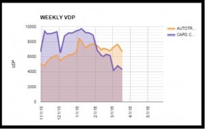
I'm seeing a big drop in SRPs and VDPs, and not just on an overall drop but on a per car drop also.

Chart 1 shows a drop in weekly projected SRPs for this dealership's inventory.
Chart 2 shows the same dealerships weekly drop in projected VDPs.
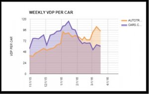
Chart 3 shows the drop in those VDPs on a per car basis.
weeklysrm_carscom.jpg

weeklyvdp_carscom.jpg

weeklyvdp_percar_carscom.jpg

As you can see by comparing the trends to their Autotrader stats, it's not an inventory issue because if that were the case, both Autotrader and Cars.com would have dropped at the same level.

(these are charts created in Google Drive for our clients, the projected data is pulled out of vAuto’s Merchandising tool that gets a feed from Cars.com and the monthly data comes from Cars.com and Autotrader.com backend tool)

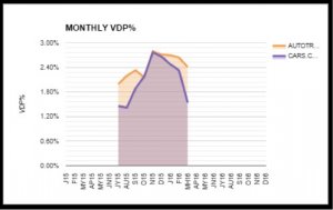
I'm also seeing a drop in VDP conversion percentage.
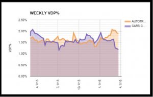
vdpconversionweekly_carscom.jpg
vdpconversionmonthly_carscom.jpg


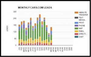
I'm also tracking a drop in leads coming to the stores.
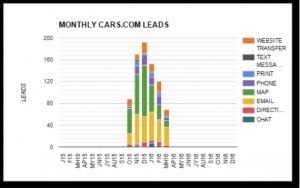
vdpleadsmonthly_dealer1_carscom.jpg
vdpleadsmonthly_dealer2_carscom.jpg

All of this is coming at a time of the year where there is usually a spike in shoppers on both Autotrader.com and Cars.com. The months of January, Febuary and March show the largest shopper count year over year on Autotrader.com and Cars.com as you can see from the charts below..
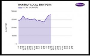
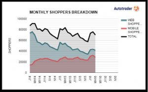
monthlyshoppers_carscom.jpg
monthlyshoppers_autotrader_com.jpg


Anyone else is seeing the same trends?
 
Great work Jasen.

Here's a brain dump of thoughts.

New UI's can:
  • Piss off repeat visitors (like when the grocery store resets their asiles ;-). Sometimes, they just give up.
  • Be designed with the shoppers pleasure in mind, not analytics hawks.
    • IOW, shitty sites force a shopper to do a lot of clicking to get to the info they want.


Sometimes, new UI's are born in a lab and weakly tested prior to launch. If this is the case, AND, if the design team misses the mark, it completely fail once they are launched.

At 1st pass, it looks as if Cars.com's new UI may be the culprit. Here are a few UI fails that I noticed:

User Story:
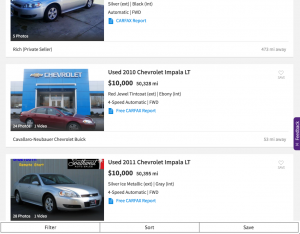
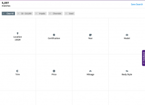
I am looking for a used Chevy Impala, I've been in-market for a few weeks. I've got a few mins before my lunch break ends, I choose [chevrolet] [impala] [default] [default] to get to the pictures & prices of impalas.
upload_2016-3-24_7-37-35.png

I didn't know that "$10,000" was max price and "All Miles" had nothing to do with the miles on the car.

The SRP returns a page that has big white space and low selection relevance ("does this have leather? roof? etc). My eye scan of the SRP can only see 2-3 cars at a time. I use SRP photos to quickly scan for new arrivals, or cars that'll catch my eye.

I realize "I've done something wrong" so I look for the facets to "improve my search"... Ah... where are they? I hit the back button to try again.
upload_2016-3-24_7-56-13.png
Our User discovers they have put the FILTER and SORT buttons on the bottom (Users are highly conditioned to look up for this use)

Then, our user clicks FILTER or SORT, they are hit with another new UI that forces them to think.
upload_2016-3-24_8-2-58.png


/end user story


The VDPs are wonderfully uncluttered
https://www.cars.com/vehicledetail/detail/663377643/overview/
A big win here!


Summary
My instincts are telling me that it's design priorities are 'mobile 1st'. (i.e. desktop takes a back seat in design discussions). They've made big efforts to simplify the UI to satisfy the 'mobile 1st' requirements, but, in doing so, they may have crushed the desktop users workflow.

If it were possible, it would be helpful to isolate mobile and non-mobile use to see whats happening.

Great stuff!
Joe
 
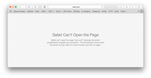
It looks like Cars.com has blocked anyone using a Dealer.com IP. Easy enough to access from my cell phone, but none of us can get to the main Cars.com site using any browser or operating system.

EDIT: this looks more like a technical issue than a strategic one. Elaboration in a later post.
 
Last edited:
Summary
My instincts are telling me that it's design priorities are 'mobile 1st'. (i.e. desktop takes a back seat in design discussions). They've made big efforts to simplify the UI to satisfy the 'mobile 1st' requirements, but, in doing so, they may have crushed the desktop users workflow.

I agree with Joe's assessment, but would like to add a quick point about cars.com's desire to drive conversions.

In my dealings with their design/product teams off and on over the past 9 years (since my Asbury days), I can honestly say that I haven't worked with a vendor who came across as less motivated to drive genuine sales leads for their dealers. Perhaps it's just a smokescreen they deploy when speaking with outsiders, but the contrast is stark when speaking with the cars.com team versus speaking with other third parties in automotive.

To that end, I think their UI was meant to be "Consumer and Mobile First," but the confusing elements Joe encountered on his Impala search were the same ones I had when first using this UI.
 
Are you assuming the "drop in leads" is based upon the confusion of repeat / return users of their system or new users that have no clue where previous or changed components are now located?

I'll just go back to what I said about user-centered design, user experience, usability testing, etc. It begs the question, did they properly design and test their update?

Usability testing
is the best way to understand how real users experience your website or application. Unlike interviews or focus groups that attempt to get users to accurately self-report their own behavior or preferences, a well-designed user test measures actual performance on mission-critical tasks.

https://en.wikipedia.org/wiki/Usability_testing
Usability testing is a technique used in user-centered interaction design to evaluate a product by testing it on users. This can be seen as an irreplaceable usability practice, since it gives direct input on how real users use the system. Usability testing focuses on measuring a human-made product's capacity to meet its intended purpose.
 
Last edited:
Alexander,
Please offer your deep analysis and solutions to the new UI.
I'll not offering anything. I didn't follow them previously and I fail to now. I could care less if Cars.com succeeds. I wouldn't spend the time or effort.

As I said, "It begs the question, did Cars.com properly design and test their update?" I've no idea if it's an UX issue causing a drop in leads, but one can hypothesis. They might have confused the users in your specific demographic @LotPop, maybe not in others. If they were smart, they'd be measuring the roll-out performance. They could be guessing it wouldn't surprise me.

Besides, the conversion numbers over the years have been weak, but still better than AutoTrader.com, etc. That is for the money. Cost / Lead and Cost / Sales (Acquisition).
 
Last edited: