• Stop being a LURKER - join our dealer community and get involved. Sign up and start a conversation.

Dealer websites with excellent User Experience

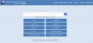
TexasDirect's CMO is very brave. They lack a robust UX, but, the desktop UI is soooo mobile first it stuns me.
https://www.texasdirectauto.com/
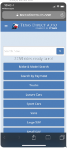
upload_2018-6-28_10-48-31.png

upload_2018-6-28_10-49-10.png

Another interesting wrinkle to this is FAMILIARITY. Users going from Desk to Mobile & vice-versa, don't need to reorient themselves as they bounce back and forth.

#VeryBraveUI
p.s. As a proof-of-concept signal, I've been ck'ing on this site for months to see if they switch to another UI.
 
I'm sort of stuck with dealer.com websites, which don't possess the same pizzaz as DealerInspire, etc. But I still made it useful and way different from my competitors. My goal is to keep people on my site and away from the manufacturer site, so I've supplied a lot of the same information; how Honda Sensing works, airbag recalls, vehicle comparisons, videos (even Honda's "How To Drive a Stick Shift" one), Honda in the news (doesn't even need to be car related) and even misc. car news like a Ferrari going to auction at $45 million. My customer time on site has gone up nearly a full minute average in just two weeks and although our website visits mtd year-over-year are down 10%, my form submissions are up by 15%, with most of that improvement coming in the past two weeks. And my Google analytics are already going up.

But the big thing is that it's really pertinent information that the customer can use. www.route23honda.com
I hear you about the stuck part, but that is a dead give away for a DDC site. Especially, with the three components below hero video. No active Vlog or Blog? What type of local or regional content are you applying to your site actively?
 
Maybe but what do you think about UX/UI?
It's OK (the menu seems a bit jammed up, but I like the body area) but it doesn't matter what I think. It matters what a larger user group (testing) thinks and how it's morphed for better usability through time. An interface should always be dynamic. It's never ever set it and forget it, but many website groups will tell you that or don't care.
 
Hello all,

Long time lurker but thought i'd sign up and reply to this one.

Last year my company developed a stock display system with an objective to show as many cars as possible to the consumer in a way that is not overwhelming.

We read a lot in these forums while we were designing the UX and helped inform a couple of key assumptions about the consumer, mainly;

1. Most consumers are on mobile
2. Most consumers think they know what make and model they want, but would be open to alternatives.

The result is here http://cars.dvg.com.au/

It is embedded on the live site but they have blocked international IP addresses, if you have a VPN switch it to Australia and you can see it embedded.

The product is summarised in the video on our landing page http://dashdealersystems.com/. We try to push the consumer to search by a make/model, then as they select tags at the top we order the vehicles from best match to worst match. Below that we show 1st and second degree matching similar cars based on a network map of vehicles we created (like this for vans http://prntscr.com/k57z7t ). My personal opinion is that price, colour and body style should also be tags instead of separate filters but the client preferred otherwise.

I am living in Toronto nowadays but the system has been well received back home, would be interested to see any thoughts on it and what elements we would have to change for North America should we decide to adapt it.
 
Last edited:
  • Like
Reactions: Alexander Lau
I guess, it's time to throw in my two cents

For the beginning, I'll tell you what is important for me in terms of usability:

- modern design, responsiveness
- no misleading buttons, no exaggerated phrases like "we are the number one, you'll be rich tomorrow, sell your car in 5 minutes, use our website and Trump is no longer a President, etc"
-no useless elements in design
-sufficient contact details, i.e. social buttons, locations, phones
- useful search and an ability to compare chosen models
-10+ vehicle photos


texas.jpg
1. https://www.texasdirectauto.com, developed by Vroom

-it looks ok, but very simple, I'd rather say primitive
-company's logo and name is clickable, however it leads to nowhere - bad practice
-"need help?" too promising/misleading. it isn't even a life chat, just a phone number, imho
-doesn't have social media buttons
-no models comparison feature
+search is ok
+a lot of vehicle photos though
 
Last edited: