• Stop being a LURKER - join our dealer community and get involved. Sign up and start a conversation.

Jeff Kershner

Founder
Staff member
May 1, 2005
4,548
1,828
Awards
12
First Name
Jeff
Google announced that they will be penalizing websites that use "interruptive" pop-ups, especially if they cover a significant amount of the page.

Come'on Google, not all pop-ups are bad. Many bloggers, marketers and webmasters swear by them for list building and lead conversion. We have SEVERAL companies in our industry that offer and have all but built their whole company around a "Pop-Up".

Here's an article with more specifics - http://www.socialmediatoday.com/marketing/google-penalty-pop-ups-coming-2017

If Google plans to penalize your dealership for your pop-up, will you continue on with it or discontinue?
 
For most dealers, this is probably a good thing, given that removing the mass of overlays (chat drop-ins, coupons, gift card offers, surveys, etc.) from the first viewed page will likely not reduce leads much while it improves user experience. Moreover, it should drive more dealers to seek better ways to engage departing visitors with exit widgets and instant retargeting (which will more than make up for any lost leads from the new Google policy).
 
  • Like
Reactions: John W.
@Stauning what leads do you think a dealer would lose from the entry page? Are you referring to the pop-unders?

Traditional pop-unders appear to be safe, but non-responsive pop-ups (which includes the gift card div layers, chat drop-ins and surveys) that block too much content could be problematic. Like nearly every Google rule, we may not fully understand the impact until they begin enforcement.
 
  • Like
Reactions: Alex Snyder
If it is a matter of penalty, I think we're going to have to abide by the big G's rules...
Mobile or not, it still is a big deal because you can get punished.

An overreaction is an overreaction even if it's in the face of a new Google rule. Google has been very clear about this: https://webmasters.googleblog.com/2016/08/helping-users-easily-access-content-on.html

Any dealer that overreacts "just because it's Google" is costing themselves sales. Not a wise strategy.
 
Hello! I'm a noob here but looking forward to contributing. Hope this is a helpful one.

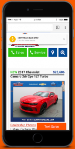
From the research we did the key is exactly what's referenced in the post @Stauning linked: the modal should only take over a modest part of the screen in its initial phase. So, as an example only, it's image "a" versus "b" as attached to this post. However, it seems that once a visitor engages the smaller banner it can expand to walk them through a flow. Meaning if a visitor clicks on A we can walk the visitor into B, and so forth.

I think it's actually a more exciting UX, even though it's pushing SEO-conscious vendors (including us) to do a major system update to be ready for it.

A) Screen Shot 2016-11-29 at 2.53.24 PM.png

B) Screen Shot 2016-11-29 at 2.56.47 PM.png