- Mar 24, 2020
- 72
- 64
- Awards
- 4
- First Name
- Matthew
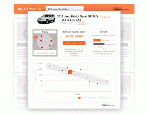
 Take a look at our newly re-designed market report! When it launched in 2014, TradePending’s SNAP market report instantly became a game-changer for consumers looking to value their trade-in. For the first time in forever, consumers could see local supply and demand for their trade-in, along with other comparable vehicles for sale.
After being a tireless workhorse for the last six years, we’ve made some improvements to our innovative consumer-facing market report. These changes bring greater local-market vehicle comparative facts, dealer talking points, and easy-to-read visualizations to build engagement and confidence for all auto shoppers and trade-in candidates. Here’s what’s changing and why.
Overall Design
We’ve moved up the mileage box to make it easier for the customer to see and verify their mileage, which helps everyone arrive at a more realistic value for their trade-in. We’ve also brought in a stock image of their vehicle to relate to their vehicle’s market report.

The Supply Box
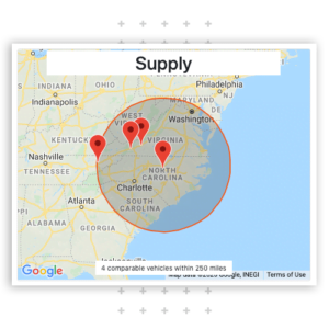
Previously we listed the number of cars available for sale within a certain radius of a dealership’s zip code. We expanded out in 25 mile increments to reach a minimum of 30 cars.
In our new version, we plot the comparable vehicles on a map within a fixed radius of the dealer’s zip code. This provides a truer, and more visually appealing, representation of local supply. As with our scatter plot graph, the comparable vehicles shown are not clickable.
With this Supply change we have now detached the Supply box from the value-calculation scatter plot below. TradePending’s renowned and trusted valuation methodology remains unchanged.

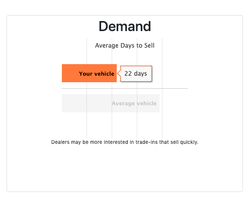
Our previous version presented a “Demand Index” that normalized the days on the market of that trade-in to a 1-10 scale. If the user hovered over the demand number, they could see the average days on market.
The updated market report now compares the average days on the market of the consumer’s vehicle in a dealer’s local market to the average days on market for all vehicles. This approach makes it easier for consumers and dealers to accurately gauge how quickly their call typically sells. We’ll also be folding in additional data for average days on the market of their vehicle compared to all vehicles in the same model year and same vehicle class.

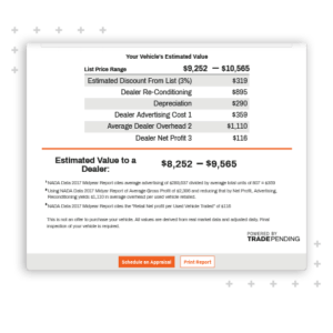
The Estimated Value / Explanation of Costs to a Dealer
In this case, the data remains exactly the same, we’ve just made it a lot easier on the eyes for consumers to read the data.
Our mission continues to be “simple automotive”, making it easier for consumers and dealers to have better conversations. Trust grows when buyers and sellers agree on how the dealership arrives at a value. These new designs further improve readability, making it easier for everyone to understand. Less time explaining means more time talking about the buyer’s wants and needs.
If you’d like to see these new changes first-hand, visit any TradePending dealer’s website, or schedule a demo with our team.


