Lab data (simulated data) vs. field data (real-world users data)
While lab data is helpful for developers like you (and those devs on our team) to get a directional sense of how new coding work might perform in the wild, we focus on the real-world CrUX assessment Google is using to reward/punish sites and generally signal if a site is shopper-friendly or not: Core Web Vitals (CWV).
CrUX determines how Google evaluates real-world performance outcomes for ranking purposes.
Lighthouse is a diagnostic and auditing tool used to identify technical, performance, and accessibility issues.
Good CrUX does not invalidate Lighthouse findings; it simply means average users are not currently experiencing severe performance friction.
Common reasons CrUX looks good while Lighthouse looks bad:
- Heavy desktop traffic masking poor mobile UX
- Repeat users benefiting from cache
- CDN warming effects
- Low traffic volume smoothing data
- Broken experiences affecting a small but legally relevant population
Shift Digital's 2025 Pulse Report stated $30 of every $100 spent driving shoppers to a dealer site is WASTED when failing CWV.
This is
marketing math, not a proven causal claim.
With lab data, you can run a PageSpeed Insights report one minute and another 5 minutes later and get dramatically different results (see more below).
Run-to-run variance in Lighthouse is expected and documented, but that does not invalidate the diagnostic value of the metrics. In practice, Lighthouse is used to identify persistent patterns and root causes, not to chase single-run scores. Volatility itself often indicates non-deterministic or third-party-driven performance issues rather than noise.
CWV
As you know, CWV is only measuring Largest Contentful Paint (LCP), Interaction to Next Paint (INP), and Cumulative Layout Shift (CLS). Sharing this for the general audience that likely doesn't know the technical nuance of lab data vs field data.
These are the three KPIs dealers need to focus on when it comes to website technical performance.
CWV reflects three important real-user outcome metrics, but it is not a comprehensive measure of technical performance. CWV validates outcomes; diagnostic tools are required to understand causes and risk.
For our client
Fishers Imports, you reported:
Not only does the site
PASS CWV for mobile and
desktop [Origin Mode], using REAL-WORLD CrUX data...
FCP was 1.2s and LCP was 1.4s:
View attachment 9695
Good CrUX + poor Lighthouse usually means the site performs well for
most returning or cached users, but has real problems for first-time users, edge cases, or constrained devices.
Common causes (which your Lighthouse report literally shows):
- Heavy unused JS (230 KiB)
- Long main-thread tasks
- Third-party scripts
- Non-deterministic rendering
- Accessibility violations (labels, contrast, landmarks)
These issues:
- Often don’t move CrUX averages
- Do affect individual users
- Do create legal and UX risk
- Do show up clearly in Lighthouse
So Lighthouse isn’t contradicting CrUX it’s
revealing what CrUX hides.
This CWV assessment is standard out-of-box performance for Overfuel websites when we are able to keep the dealer from adding outdated technology that breaks performance, abusing GTM instances, etc. (IFYKYK)
If you're using lab data to diagnose legal liability regarding ADA accessibility -- WHICH WE BELIEVE NO DEALER SHOULD DO -- Fisher's score is 90.
Ran a second report on Fishers to gauge the volatility in lab data results (literally NOTHING changed on the site):
CWV outcomes and Lighthouse diagnostics serve different purposes. CWV reflects historical averages, while Lighthouse identifies deterministic performance and accessibility issues that may not materially affect CrUX aggregates but still impact individual users. Dismissing lab findings entirely conflates outcome validation with risk assessment.
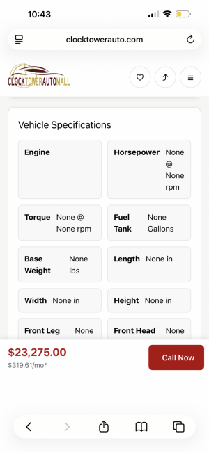
Let's check on Clocktower Auto:
My site was only live with Clocktower Auto for a little over a month, I went live durian the holidays, sales dropped and I got blammed.
However as you said, CWV cannot be used to evaluate real-world performance in that case. In the absence of field data, Lighthouse diagnostics are the appropriate tool for identifying first-load behavior, architectural issues, and accessibility signals. While Lighthouse scores may fluctuate, the underlying findings remained consistent across runs, which is precisely the intended use of lab diagnostics.
I'll setup another site over the weekend for you to take a look at.
Again, we DO NOT RECOMMEND anyone use this simulated score as a definitive measure of accessibility risk.
To clarify, I’m not suggesting Lighthouse or any lab tool should be used as a definitive determination of ADA compliance. That would be incorrect. Lighthouse is useful for identifying known accessibility barriers and prioritizing manual testing, not for issuing legal judgments.
Where concern arises is with the use of accessibility overlays. Overlays do not make a site ADA or WCAG compliant, because they introduce a separate, opt-in experience that requires user interaction and does not address the underlying semantic and structural issues in the site. In practice, overlays remediate only a subset of issues and do not provide an equivalent experience for users with and without disabilities.
Industry guidance and case law increasingly recognize that accessibility must be built into the core experience rather than layered on top of it.
Conclusions
Lab data (simulated data) is a necessary tool to help developers make best guesses at how website tweaks will perform in the real world, pre-deployment.
CWV assessments are where the rubber meets the road and reveal real-world shopper experiences with your website. Also, Google is rewarding and punishing to some degree based on the assessment result.
CWV shows how the road has felt to most users over the past 28 days. Lab diagnostics are what tell you whether the road is structurally sound.
Your assertion that Overfuel creates outsized legal liability for dealers is factually incorrect and misrepresents our platform in a way that could be harmful to the business. Additionally, for those looking, we are fans of accessiBe -- good tech.
I want to be precise here, because accuracy matters for both sides.
My position is not that Overfuel
intentionally creates legal liability, nor that it is uniquely negligent. The point is structural: platforms that rely on third-party accessibility overlays or widgets (including accessiBe or similar tools) are
not, by definition, fully ADA or WCAG compliant and do not materially reduce legal exposure for dealers.
Your statement that you are “fans of accessiBe” reinforces this distinction rather than contradicts it.
Accessibility overlays:
- Do not remediate underlying semantic, structural, or interaction-level accessibility failures
- Do not satisfy WCAG conformance requirements on their own
- Have been explicitly cited in multiple DOJ statements and court filings as insufficient for ADA compliance
- Are frequently referenced in demand letters and lawsuits as evidence of attempted, not achieved, compliance
As a result, platforms that require or recommend overlays are inherently shifting compliance responsibility and therefore risk back to the dealer.
This is not a judgment of intent or quality of engineering effort. It is simply the current legal and technical reality of accessibility enforcement in the U.S.
My original assertion stands on that basis alone:
true ADA compliance must be built into the platform itself, not added post-hoc via overlays. Anything short of that leaves dealers exposed, regardless of good faith or tooling choices.
If you believe your platform achieves WCAG 2.1 AA (or higher) conformance
without reliance on third-party overlays, I’m happy to review that claim on technical merits.