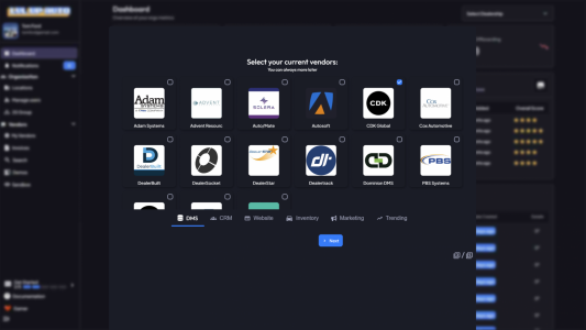
New user vendor selection for onboarding was designed last night. Thanks to @BillKVMotorCo for the feedback. That should get wired up today.


The new visual onboarding was wired up and QA tested last night. I really like the new flow. It gives you 1/3 of the total vendors in 5 of the categories (dms, crm, website, inventory and marketing) as initial choices. You can quickly add them. It loops through all your selections and creates draft deals with each so you can add the terms later. This ends up allowing you to add way more vendors in way less time.New user vendor selection for onboarding was designed last night. Thanks to @BillKVMotorCo for the feedback. That should get wired up today.
View attachment 8401
This is perfect. Great job.The new visual onboarding was wired up and QA tested last night. I really like the new flow. It gives you 1/3 of the total vendors in 5 of the categories (dms, crm, website, inventory and marketing) as initial choices. You can quickly add them. It loops through all your selections and creates draft deals with each so you can add the terms later. This ends up allowing you to add way more vendors in way less time.
The UI is also fun versus typing vendor names! Mobile came out pretty smooth also.
What app are you using in this screen shot?The next enhancements I'm working on are the post onboarding noob stages and side quests. Time to make some videos
View attachment 8419


