#RefreshFriday Merchandizing - Someone is Launching a new Service | Joe Pistell

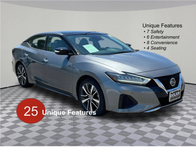
Money Shot • Design #2.
View attachment 8325
Thoughts?
First thought is the goal behind the word choice of unique. I can see this two ways, to either elicit curiosity from the customer or to help the car stand out. I think its good for curiosity not as good for standing out. I wonder if its possible to place this in the right hand corner with what looks like a page of a book.

Screenshot_20231213_102430_Chrome.jpg

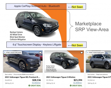
If you display the 22 in next picture and highlight the marquee features that would fulfill the promise your making in the first image.
 
  • Like
Reactions: Chris Cachor
Placing the text of the features on images with highly variable background colors is difficult. It's possible to create bounding areas automatically but why make it hard. Another reaction is why say unique features twice on one image. I think a designer could help out. As you know the 2-4 marquee features are what drive sales not the 22. So teasing those seems important.
 
It's possible to create bounding areas automatically but why make it hard.
Add Stroke to text.

Another reaction is why say unique features twice on one image.
Thnx. The 2 statements are distant from each other. Using identical name ties them together.

2-4 marquee features are what drive sales not the 22
The universe of hot features is relatively small. When you have 23 Ram 1500's, 2-3 features will look redundant.

thnx again JB