• Stop being a LURKER - join our dealer community and get involved. Sign up and start a conversation.

Uncle Joe's Makeover Diary 2.0

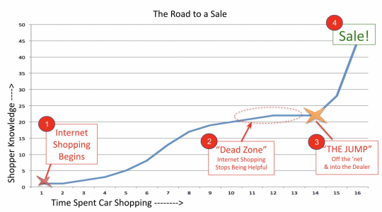
my high-level take on the internet car shoppers journey.
1669990124945.png

My work focuses on Zone 2, the dead zone. This where the car shopper is narrowing their final choices and the questions they have get VERY complex. Evidence of this complexity is seen where your shoppers arrive at your store with more questions than answers (e.g. test drives, final price, trade, payments).

It is my belief that the dealer's website MUST find a way to communicate "give us a call or stop in, we're here to help". Shoppers in Zone2 are 'working the internet but they're not getting closer to the the final decision'. They're frustrated, fatigued and fearful from making a mistake.

In zone2, it's mission critical for the dealers website to sell the VIN & sell "a productive and successful end to your shopping"
 
Last edited:
@joe.pistell how are you planning to tackle the disparity between the deal they build online and the final deal, which is packed with add-ons, insurances, protections, etc.
Do you have a tool that lets them see a realistic quote for anything outside of the vehicle itself?

We have to be extra cautious up here because every advertised price and payment is essentially a legal offer to the customer.
 
@craigh, good point, but you have isolated one use case where your intended outcome of the website is to deliver a penny-perfect quote (i.e., a legally binding quote). IMO, that's NOT the problem I am trying to solve; I believe most shoppers in Zone 2 are not seeking "legally binding quotes" from my seat, and the overwhelming majority have far too many variables to consider before they settle on the final VIN. Instead, they factor in how the trade AND the rates and monthly payment CHOICES will cause them to CIRCLE back and rethink the price point of the car they hope to buy.

This reply is not a plug, but Snyder's Illumiquote specifically addresses the car shoppers' desire to USE RANGE TOOLS to juggle multiple variables to help them get closer to a place of knowledge and confidence.

For this user profile above, the end game of the dealer's website isn't to be amazon; it's to give the shopper a reason to 'let go of the mouse and get out of the house.' IOW, the website messaging has to be pointed at causing "the jump" to happen; it needs to communicate a feeling that "this store fits what I have been looking for." Illumiquote is one small part of this mission.
1669995020958.png
 
Last edited:
the dealer's website isn't to be amazon; it's to give the shopper a reason to 'let go of the mouse and get out of the house.' IOW, the website messaging has to be pointed at causing "the jump" to happen; it needs to communicate a feeling that "this store fits what I have been looking for."
Get creative, find ways to sell that VIN and tell your story.

"Let go of that mouse and get out of the house"
--The famous Tim Jennings

12 yrs later, Tom Spark sales team is still finding value in Tim Jenings work and posting youtube videos onto their VDPs
 
  • Like
Reactions: Karen Ann
Our Websites SUCK (industry wide). Does your website suck?
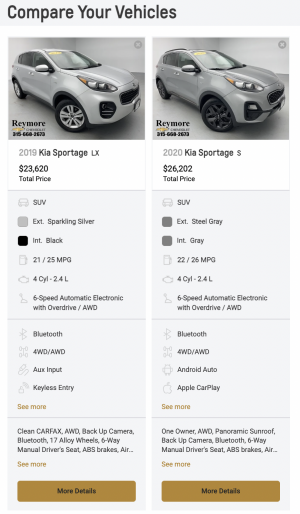
My work focuses on Zone 2, the dead zone (see chart above). The dead zone is why and where digital retailing dies. Why o why does our 'compare vehicles' suck?

The Sportage on the left is a base, and on the right the Sportage is loaded. Grrr WTF :cursin:
1670073579774.png
This is a dealeron screenshot How is your compare vehicles page? Is it intelligent? Does it help the shoppers goals by showing a summary of the most important diff's at the top and allow the shopper to dig deeper into the attributes?

Look at your site and use the compare vehicles page. If it's helpful, PLEASE post a link here!
 
  • Like
Reactions: craigh