• Stop being a LURKER - join our dealer community and get involved. Sign up and start a conversation.

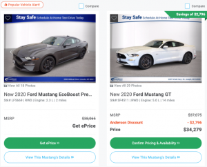
Evolving Call to Actions - should ePrice die?

Those are great numbers @Tarry Shebesta but in keeping with the topic of CTA and buttons, is the magic in getting a couple or more CTAs within a single clickable image? You have "Drive It Now" and "explore payment (implied with a shown payment)" and "Pre-Qualify" on the SRP within a single clickable image. On the VDP for this dealer, they are separated out:
View attachment 5197

Which of those buttons, separate, have the highest Click?

The DriveItNow® payment button CTAs are also on the VDP, not sure why that one didn't fire. And dealers are always trying different things in conjunction with truPayments, for example, Shop-Click-Drive. But so far our credit-first approach has always performed better.
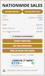
Screenshot 2020-11-19 105333.png
 
Here are some things to think about:

1. Mobile Pop-up Form fill abandonment rate
2. Pop-up forms in general
3. Pushing customers into a different UI/UX - Customers can experience what we define as "Digital Shock" (used this back in the telco days of building customer journeys); meaning is defined as user's exiting of a site or journey due to a different UI/UX from where they originated from.
4. Verbiage of CTA - Social Psychology is at play here; Carvana utilizes it very well. I love the "Today's Price" CTA ---> Social Psychologist would say that this is counter intuitive because a consumer would think that yesterday's price or future price may be better or worse making them less likely to inquire. "Get E-Price" is meaning less and provides no value.
5. More CTA's = Paralyzed Users (less conversion, not more)
6. Value = Information. Customers perceive their PII (personal identifiable information) as being valuable. Therefore, what value are you providing to the consumer in return for their information.

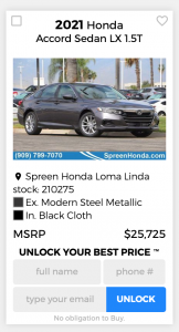
Taking all of this into account, we built the following utilizing our Trademark "Unlock Our Best Price" & "Unlock Your Best Price":

Screen Shot 2020-11-20 at 5.13.35 AM.png
 
Here are some things to think about:

1. Mobile Pop-up Form fill abandonment rate
2. Pop-up forms in general
3. Pushing customers into a different UI/UX - Customers can experience what we define as "Digital Shock" (used this back in the telco days of building customer journeys); meaning is defined as user's exiting of a site or journey due to a different UI/UX from where they originated from.
4. Verbiage of CTA - Social Psychology is at play here; Carvana utilizes it very well. I love the "Today's Price" CTA ---> Social Psychologist would say that this is counter intuitive because a consumer would think that yesterday's price or future price may be better or worse making them less likely to inquire. "Get E-Price" is meaning less and provides no value.
5. More CTA's = Paralyzed Users (less conversion, not more)
6. Value = Information. Customers perceive their PII (personal identifiable information) as being valuable. Therefore, what value are you providing to the consumer in return for their information.

Taking all of this into account, we built the following utilizing our Trademark "Unlock Our Best Price" & "Unlock Your Best Price":

View attachment 5210
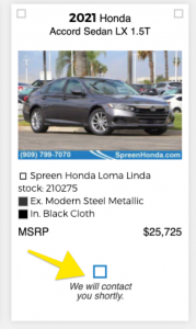
@Jason@nabthat So your solution just pulls the rug out from underneath the shopper in the worst way possible? Once you get them to submit, the experience stops cold until the store can contact you and control everything? That seems like a step back in time. You have data that this is working? Or that shoppers even accept this strategy in 2020?
Image 2020-11-20 at 8.00.39 AM.png

And what is the deal with the tiny squares? Or is something broken on desktop?
Image 2020-11-20 at 8.04.45 AM.png
 
Here are some things to think about:

1. Mobile Pop-up Form fill abandonment rate
2. Pop-up forms in general
3. Pushing customers into a different UI/UX - Customers can experience what we define as "Digital Shock" (used this back in the telco days of building customer journeys); meaning is defined as user's exiting of a site or journey due to a different UI/UX from where they originated from.
4. Verbiage of CTA - Social Psychology is at play here; Carvana utilizes it very well. I love the "Today's Price" CTA ---> Social Psychologist would say that this is counter intuitive because a consumer would think that yesterday's price or future price may be better or worse making them less likely to inquire. "Get E-Price" is meaning less and provides no value.
5. More CTA's = Paralyzed Users (less conversion, not more)
6. Value = Information. Customers perceive their PII (personal identifiable information) as being valuable. Therefore, what value are you providing to the consumer in return for their information.

Taking all of this into account, we built the following utilizing our Trademark "Unlock Our Best Price" & "Unlock Your Best Price":

View attachment 5210
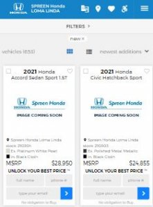
Hi Jason - what's the mobile vs desktop conversion rate of that form?

Just curious if mobile users have a hard time filling out the form because Google recommends having tap targets be at least 48px on mobile, yours are only 18px. The gray field labels also blend in with the gray field background.

Makes it difficult for my young eyes to see and young fingers to tap, I can only imagine that it's even more difficult for older clientele. Just needs some easy UI/UX improvements :)

Also any data on hiding a form behind a CTA button vs displaying the form right up front as your platform does? Genuinely curious.

mobile.JPG
 
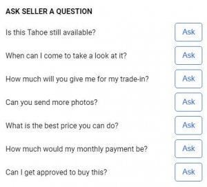
We're currently testing a sticky messenger based CTA.

We examined all of our website chats and categorized the chats based on customer questions. The #1 question: "Is this available?"

So we made that our primary pre-filled message but also have a dropdown menu that allows a customer to select from the other most commonly asked questions.

Too soon to tell results.

cta message.JPG


questions.JPG
 
Hi Dan,

Not sure why you feel that the information I provided warrants your response.

So your solution just pulls the rug out from underneath the shopper in the worst way possible?

What is the "worst way possible" with our solution? Pricing guidelines restrict dealers from showing pricing information to consumers. So "Get EPrice" and "Today's Price" are good for you?

the experience stops cold until the store can contact you and control everything?

You are assuming the experience stops cold. Our platform has multiple functionality to show pricing immediately upon the consumer submitting their info.

Let's have some constructive conversation and not attack those that are only providing assistance.

Have a good weekend Dan.
 
Hi Jason - what's the mobile vs desktop conversion rate of that form?

Just curious if mobile users have a hard time filling out the form because Google recommends having tap targets be at least 48px on mobile, yours are only 18px. The gray field labels also blend in with the gray field background.

Makes it difficult for my young eyes to see and young fingers to tap, I can only imagine that it's even more difficult for older clientele. Just needs some easy UI/UX improvements :)

Also any data on hiding a form behind a CTA button vs displaying the form right up front as your platform does? Genuinely curious.

Ryan,

Use the information I provided as needed. Google recommendations are not the end all be all. Have no issues with others.

We have data.
 
We're currently testing a sticky messenger based CTA.

We examined all of our website chats and categorized the chats based on customer questions. The #1 question: "Is this available?"

So we made that our primary pre-filled message but also have a dropdown menu that allows a customer to select from the other most commonly asked questions.

Too soon to tell results.

View attachment 5214


View attachment 5215

I really like this. Great way to identify what the customer wants. Might be different for every brands/models too. Great job @Ryan Everson
 
  • Like
Reactions: Ryan Everson
Ryan,

Use the information I provided as needed. Google recommendations are not the end all be all. Have no issues with others.

We have data.
Hi Jason, would you be willing to share the data on the conversion rate of a CTA button vs. an inline form if you have it? I'm not trying to attack, I'm genuinely curious which performs better because I've seen it both ways and always wondered what converts better.

It seems like all of the third party sites (Autotrader, Cars, CarGurus) still use an inline form, while most dealership website providers have switched to a CTA button. That leads me to assume that the third party sites have run tests and found that the inline form performs better. But I hate to assume things.

Regarding my color and sizing suggestions, that was just some constructive feedback on what I experienced as a user. I'm sure I'm not the only one that could have an issue tapping something super tiny or seeing gray font on a gray background. Could give your sites an even bigger conversion boost :)
 
Last edited:
Here are some things to think about:

1. Mobile Pop-up Form fill abandonment rate
2. Pop-up forms in general
3. Pushing customers into a different UI/UX - Customers can experience what we define as "Digital Shock" (used this back in the telco days of building customer journeys); meaning is defined as user's exiting of a site or journey due to a different UI/UX from where they originated from.
4. Verbiage of CTA - Social Psychology is at play here; Carvana utilizes it very well. I love the "Today's Price" CTA ---> Social Psychologist would say that this is counter intuitive because a consumer would think that yesterday's price or future price may be better or worse making them less likely to inquire. "Get E-Price" is meaning less and provides no value.
5. More CTA's = Paralyzed Users (less conversion, not more)
6. Value = Information. Customers perceive their PII (personal identifiable information) as being valuable. Therefore, what value are you providing to the consumer in return for their information.
@Jason@nabthat I found your 6 points beneficial (#3 is spot on) and my response was based on a bit of shock that you're basically not taking your own advice (#6) and giving the customer no value or even the implied return (the price) for their PII. Why not actually Unlock the Price? We show "Get ePrice" when there is no price in the feed (I hate that), usually because of a people issue (manager hasn't got to it yet). Once it is priced, we show it. I understand if you have a price restriction from the OEM but aren't there ways around that with Chat? I didn't mean to offend (I should have giving you props and THEN my comment) but my comment about the tiny squares is a legit question. We all have sites that break. See I'm not waving a flag of perfection:
Image 2020-11-20 at 9.59.54 AM.png

Vendors have got to chill out on this forum. Instead of offering their product as the fix or answer, explain how they came to that answer (with data) within their product and not be fearful that a dealer may be able to replicate without using their product. Are vendors using Dealer Refresh as a sales opportunity or an opportunity to partake in discussion to improve the industry. @Tarry Shebesta could have shot back at us but I felt he handled the questions with calm and a professional approach.
 
  • Like
Reactions: ChrisR