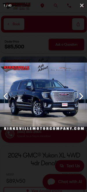
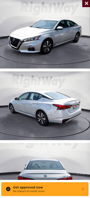
Not sure what you're asking for. but here points that I see:
I am only reviewing the VDP card and not all the other parts of the site that are causing a bad user experience like the log in popping up every few clicks. This is possibly a security issue. Don't advertise your platform technology.
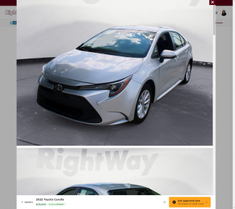
Is the focus to have the shopper focus on the vdp card or the vdp ? This design is like going to keep the shopper on this main listing page since it puts less focus on clicking into the actual VDP.
So for the VDP card:
you have 3 CTA buttons and none of them take you to the actual Vehicle Details Page.
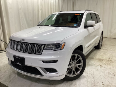
I have trouble reading all the features on the first image.
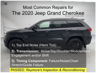
The exterior options are heard to read too. I suspect this is an accessibility issue for the majority of the points.
The 4 links and are you sure you want the details as the last in importance or does this just work better as on being on the right.
the links and buttons are inconsistent in implementation.
Compare could be broken it doesn't save ti's state.
the save and compare is vague in how to use their functionality. I click and nothing happens.
The consistency of the vdp card should be a super easy fix.
Somebody made fun of me for using light house but it's cheap and easy to access:
image dimensions need to be adjusted
layout shifts are happening
Large content paint issue (solve the speed issues and this might resolve)
The responsive is good for the vdp card but the site itself fails.
I did see the schema org data. this is good.


