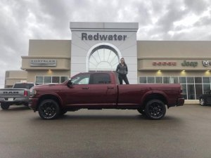
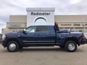
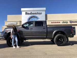
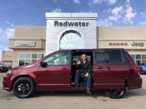
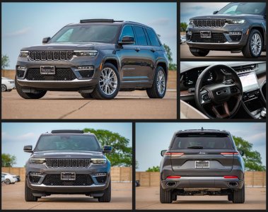
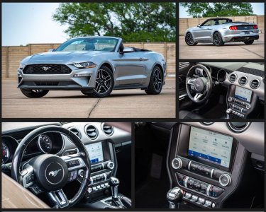
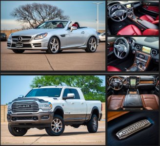
Great examples, thank you, and keep them coming!
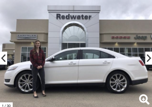
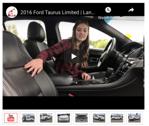
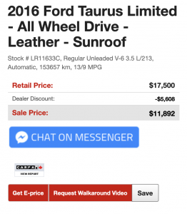
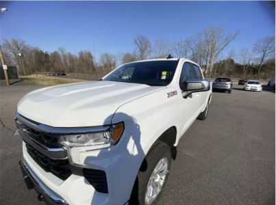
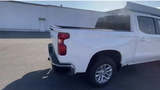
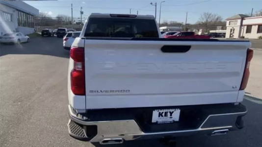
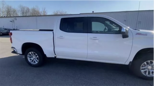
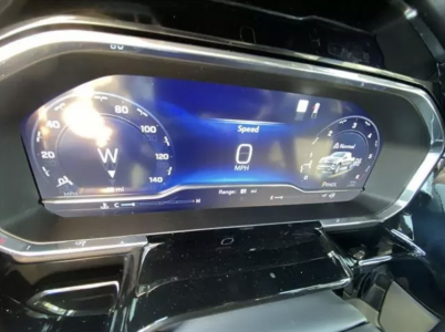
Question for the group: I along with others have advocated getting images of high-value, differentiating options early in the photo carousel. So instead of a 24-photo carousel having 12 exterior, then 12 interior photos, we would instead capture 2-3 exterior photos, then jump inside and take pictures of the rear-camera, heated seat button, and optional 3rd row, then jump back outside for more exterior photos. The idea is that if you look at Google Analytics for dealers who track photo-carousel-clicks, there is a drop off after about 8-10 images. So, if most consumers look at the first 10 images, make sure high-value differentiating options are within the first 10.
Agree or disagree?


 my bad, I was thinking of another ol' DR player, Ryan Leslie (VP sales at CarStory)