• Stop being a LURKER - join our dealer community and get involved. Sign up and start a conversation.

Alexander Lau

Banned
Feb 11, 2015
2,492
765
First Name
Alex
I've been in the market for a car and have run into some fairly bad sites. Most of you probably already know, but there are still a ton of poorly designed, unusable websites, apps, plug-ins, etc. out there.

It should help dealers actually, they should go to the 3rd party and make sure to hold them accountable.

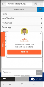
Honda North on a Samsung 8 using newest version of Google Chrome and Android OS: (chat box is obtrusive, 'text us' is clunky and covers too much space, no need for a slideshow on responsive site settings = illegible and slides flip too quickly, giant white space at the bottom of the page). Annoying to me as a potential buyer and user, makes me want to cancel the lead I had painfully submitted.
 
Last edited:
This is what showed up for me on a S8 w/ Chrome. I clicked the menu icon on the top right. The floating text widget, a floating chat widget (I think) and another text us pop up. It's to much. I mean, I literally just showed up (hypothetically walked in the door).

upload_2018-6-11_11-6-35.png
 
  • Like
Reactions: craigh
This is what showed up for me on a S8 w/ Chrome. I clicked the menu icon on the top right. The floating text widget, a floating chat widget (I think) and another text us pop up. It's to much. I mean, I literally just showed up (hypothetically walked in the door).

View attachment 3632
I'm just going to use this thread as a running log for crap auto software usage and in-person shit sales protocol experiences.

Again, it should help the dealer if a component incorrectly displays. 3rd party should have to jump.

As far as them knowing how badly their sales guys suck, that's on them. They can peruse DealerRater.
 
Last edited:
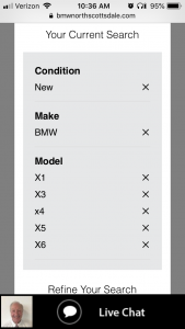
This one had me really pissed off when I was helping someone shop for a new BMW the other day. On a mobile device, if you click to shop X from the home page of bmwnorthscottsdale.com, you get this lovely SRP. You have to uncheck each model you don't want and reload the SRP ONE AT A TIME until you arrive at the X model you're interested in.

bwmnorthscottsdale-01.png
 
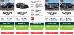
I can probably find hundreds of these but I'll spare everyone. Here's another one that makes me crazy. On righttoyota.com SRPs on desktops (https://www.righttoyota.com/inventory/New-Toyota-Camry/), when you hover over one of the cars, the image is covered by vehicle information. Ignore the fact that they have 100 CTAs for each vehicle, too. I have a tendency to track where I'm looking with my mouse, making the SRPs on this website frustrating when I'm scanning images.

a.jpg
 
I've been in the market for a car and have run into some fairly bad sites. Most of you probably already know, but there are still a ton of poorly designed, unusable websites, apps, plug-ins, etc. out there.

It should help dealers actually, they should go to the 3rd party and make sure to hold them accountable.

Honda North on a Samsung 8 using newest version of Google Chrome and Android OS: (chat box is obtrusive, 'text us' is clunky and covers too much space, no need for a slideshow on responsive site settings = illegible and slides flip too quickly, giant white space at the bottom of the page). Annoying to me as a potential buyer and user, makes me want to cancel the lead I had painfully submitted.


I'm rocking a small iPhone SE and I can't even close the "Text Us" modal. It's too large for my small screen. Renders the entire site useless on my phone.
 
Please upgrade your browser to use CarCode.
View attachment 3640
Let me get this straight... They want every car shopper to upgrade their browser to use it... and DEP throws it on anyway? Huh? Reminds me of Flash / Java plug-in upgrade issues.

view-source:https://www.carcode.com/login
notificationMessage.innerHTML = 'You are working with unsupported browser. Some features may not work. Please upgrade to a <a href="/static_assets/oldbrowser.html" target="_self">supported browser</a>.';
 
Last edited: